The Eras Tour Poster
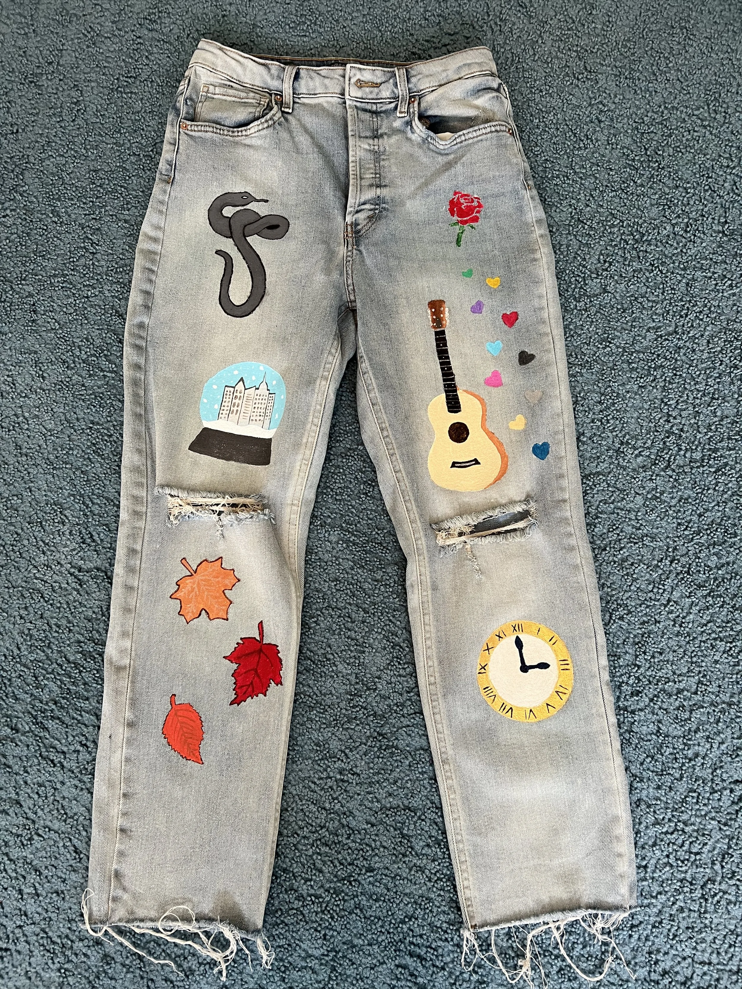
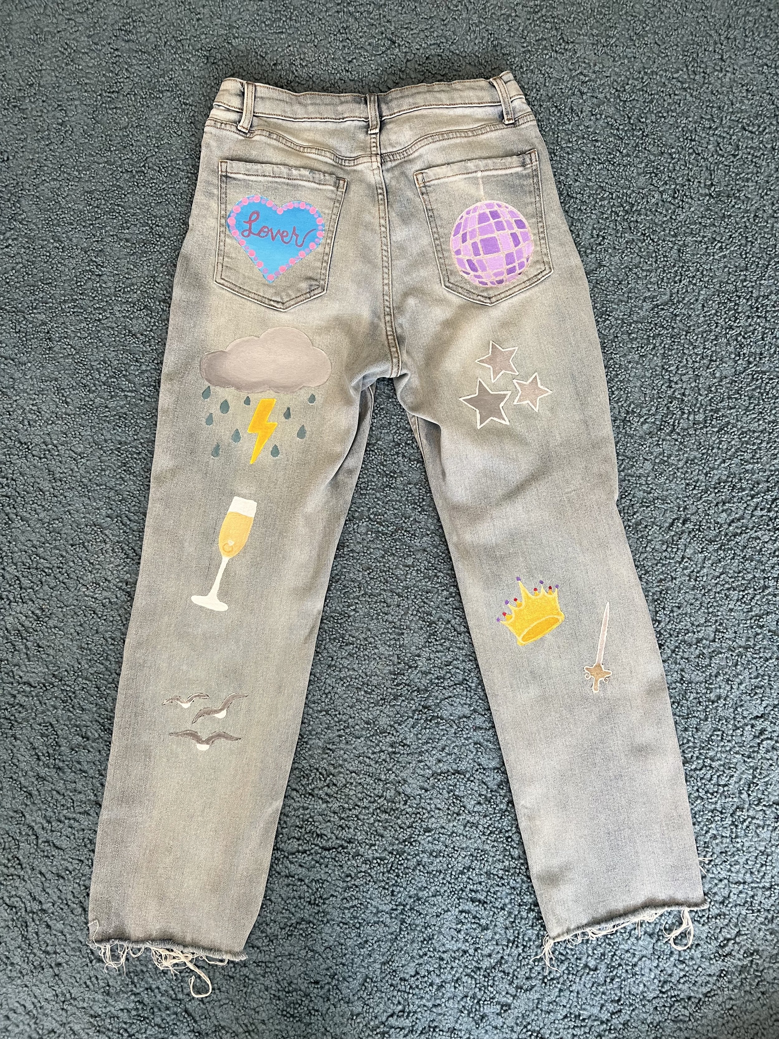
The inspiration for this project came from a previous personal endeavor, in which I painted a pair of jeans with designs that related to different Taylor Swift albums. After completing that project, I set out to create a digital poster version of these designs that I could further elaborate on to represent all of Swift’s music and eras.
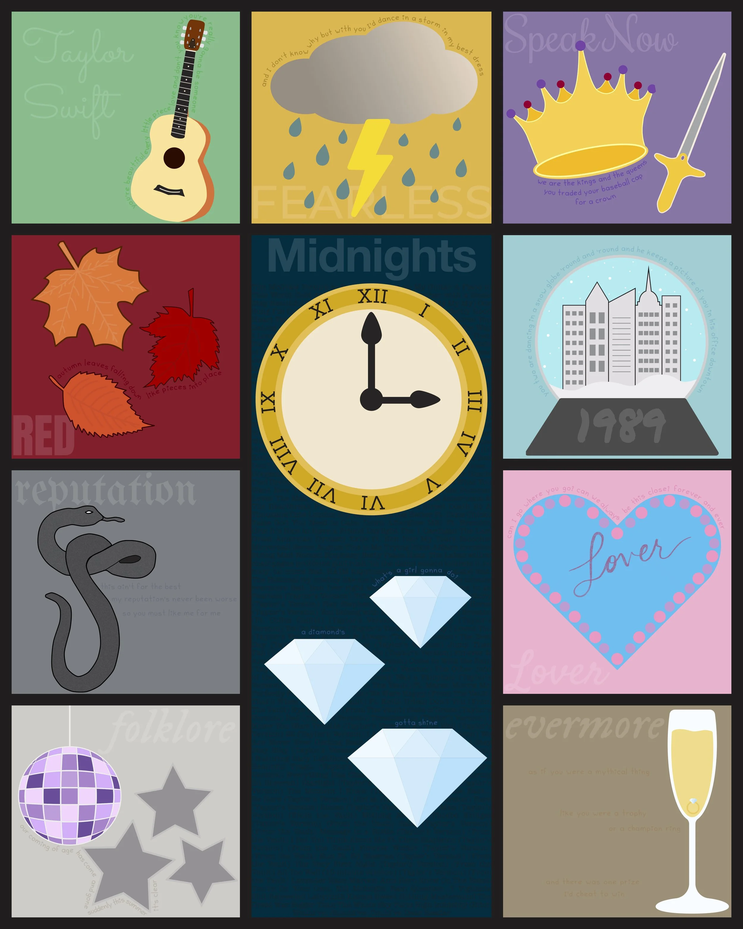
The project’s aim was to create a complete poster of vector illustrations, all correlating to the albums/eras of Taylor Swift’s discography. The final product is a poster design with the layout and colors matching the style of the official tour poster for The Eras Tour.
2023
Typography | Illustration | Layout Design
Details
The design includes every album name written in typefaces reminiscent of each official album cover and aesthetic, as well as song lyrics from each album that represent the era. Colors are pulled from the associated palettes of each album. Original illustrations were created to visualize imagery either included in songs or that correlate to each era. Each component of the poster works together to form a cohesive composition in a grid layout, as the official tour poster does. The design works as a way to engage fans of the artist and provide a thorough visual representation of the journey of Taylor Swift’s discography.
Easter Eggs
Fans of Taylor Swift know how much she loves leaving easter eggs, or hints, to what she’s doing next in her music, outfits, and social media posts. In this project, easter eggs were included through smaller details of the design. One such example is the list of all songs on Taylor Swift’s albums, both the original versions and Taylor’s Versions, that had been released at the time of creation. The song titles are set at half opacity in the background of the “Midnights” section, appearing barely visible at a quick glance. Another detail is that the opacity of every album title is set at 13%, which is the number Taylor Swift uses in many of her own clues.
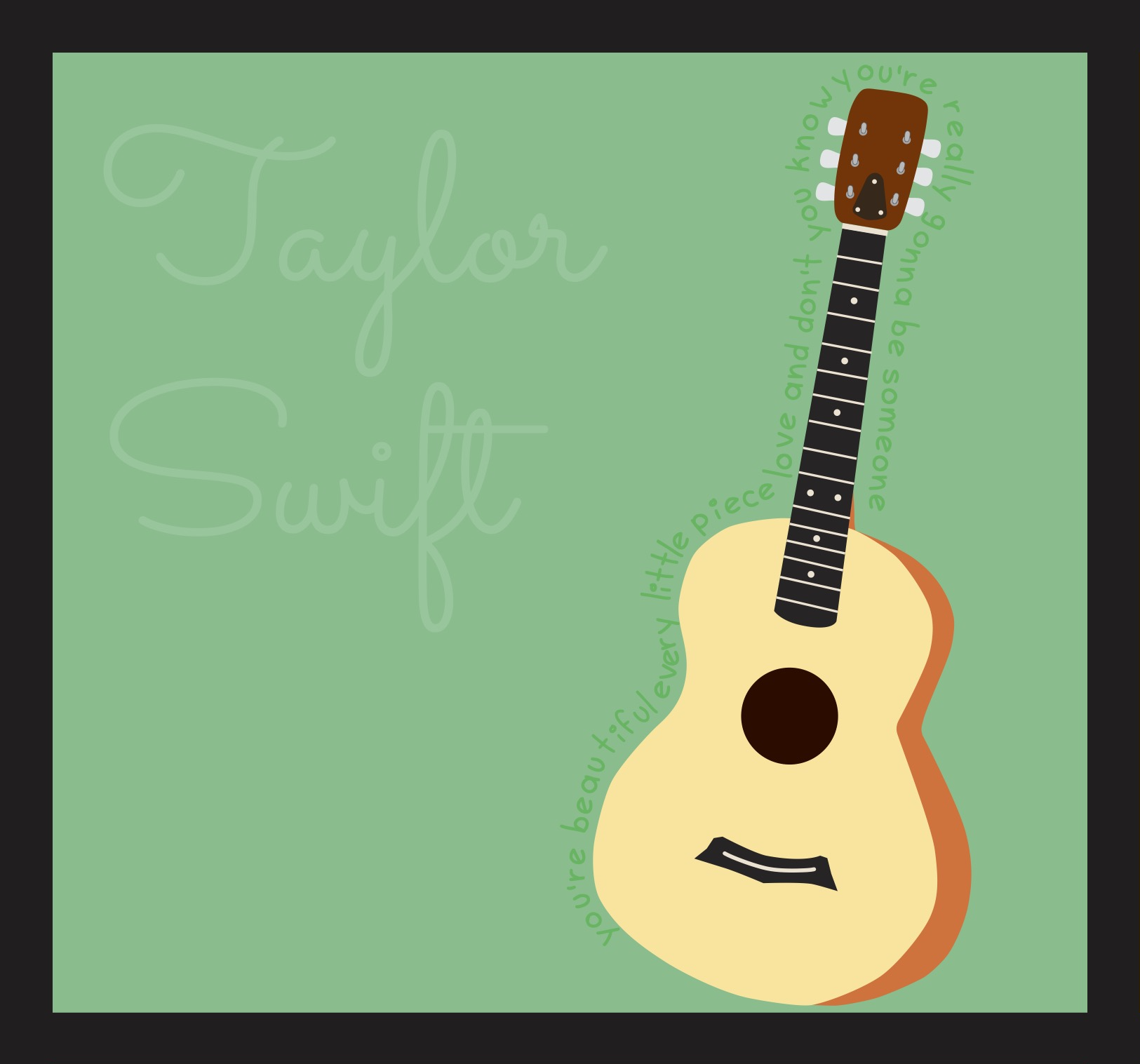
To represent Swift’s debut album, an acoustic guitar was illustrated to be the main visual. This represents the country genre of the album, as well as serving as a nod to the song “Teardrops On My Guitar”. The lyrics chosen are from the song “Stay Beautiful” as they speak to the concept of a loved one’s potential to go far in life. This is fitting for Swift’s first album as she grows from humble beginnings into the mega-pop star she is known as today.
Taylor Swift
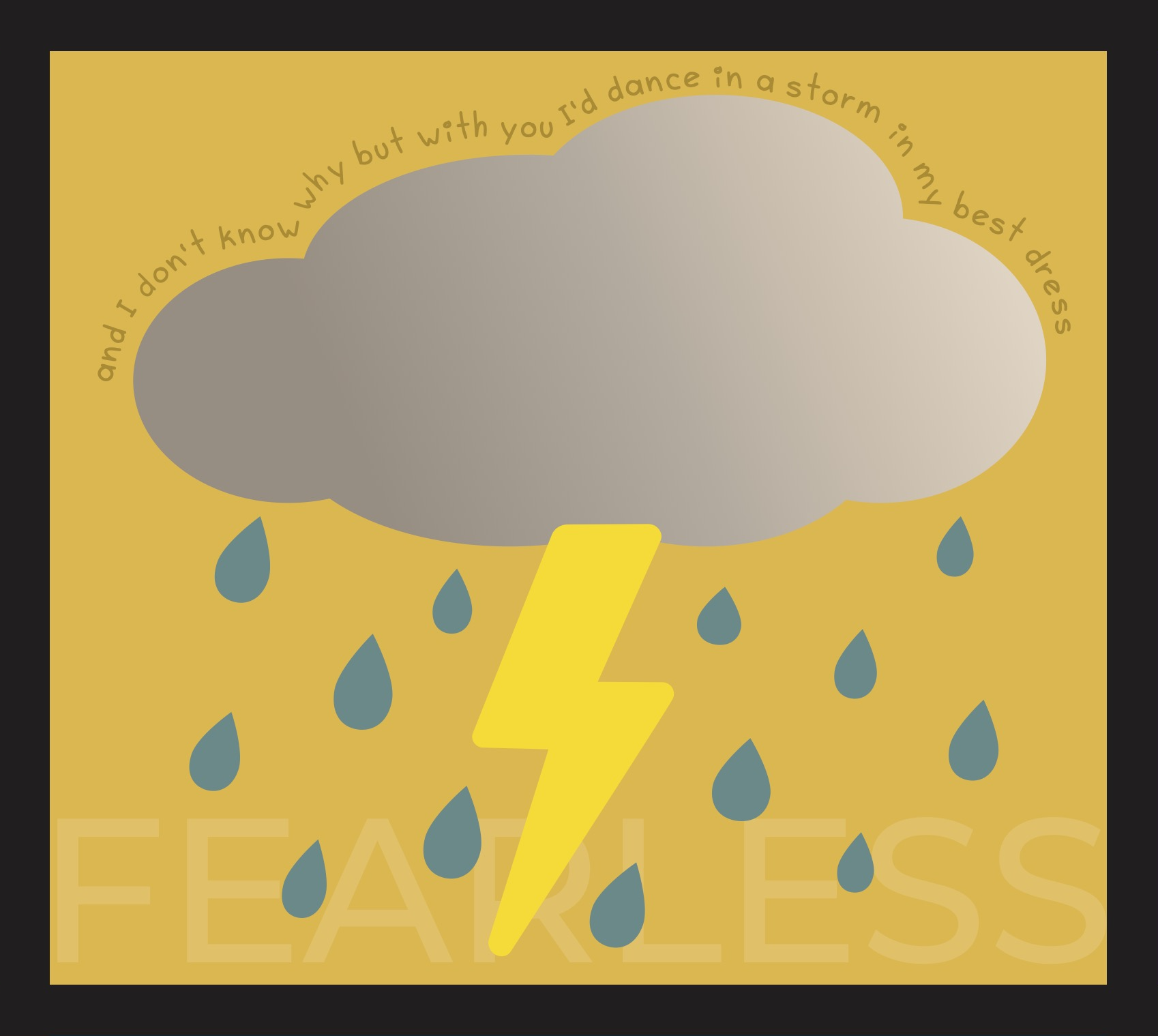
The main visual created for the second album of Swift’s was a storm cloud with a lightning bolt and raindrops. These illustrations connect directly to the lyrics chosen from title track “Fearless” about loving someone so much you would dance through a storm with them. The visual also connects to other songs on the album, such as lyrics in “Forever & Always” that mention rain.
Fearless
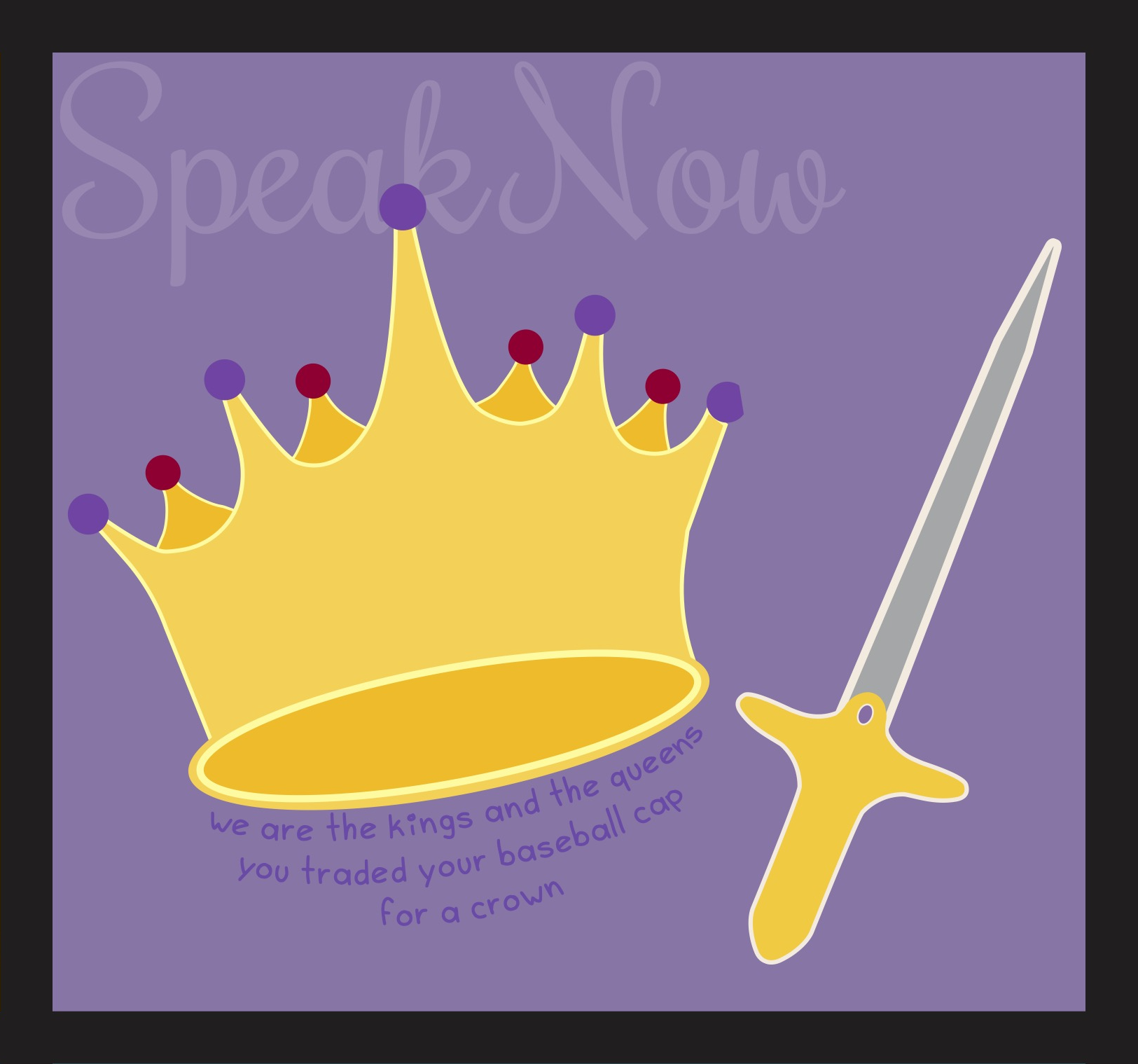
Throughout multiple songs on the third album, there are hints of royalty and fantasy themes portrayed through the lyrics. A crown and sword were created as the main visuals to represent this. Paired with lyrics from “Long Live”, the illustrations highlight that theme. The lyrics themselves speak to growing into royalty from lesser beginnings, which fits with Swift’s growing popularity during this time in her career. The alternating red gemstones on the crown represent the deluxe edition of the album, in which there is a red cover compared to the standard edition’s purple color scheme.
Speak Now
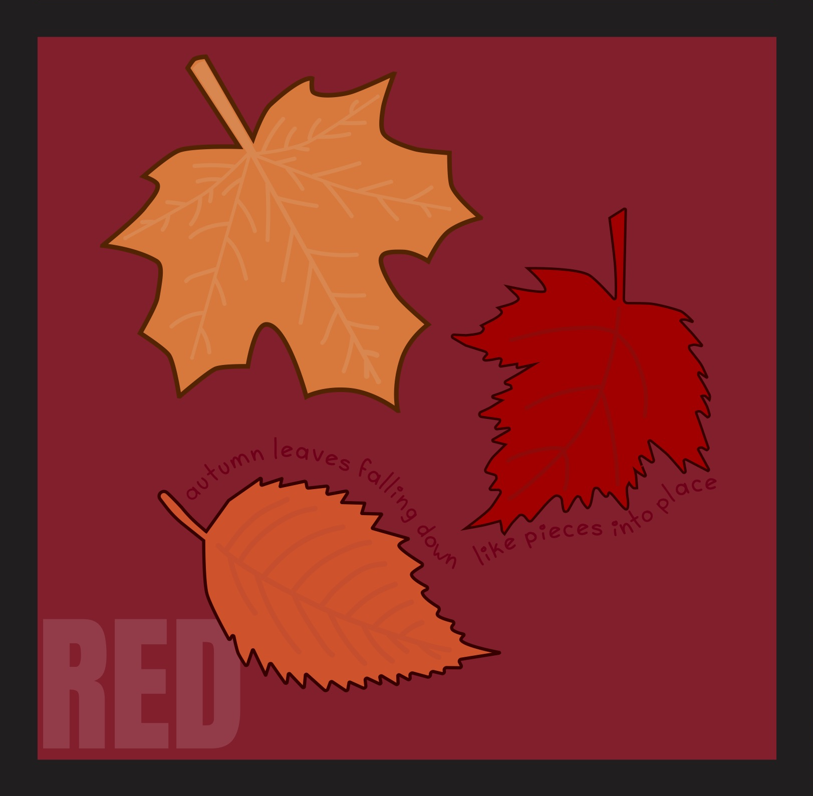
As an album with many references to autumn and the visuals accompanying that season, the illustrations for Swift’s fourth album were three leaves descending from the sky. The lyrics chosen from “All Too Well” speak directly to this visual, though there are other instances of lyrics referencing this throughout the album as well. The title track “Red” mentions autumn’s colors, which is shown through the color scheme of the leaves themselves.
Red
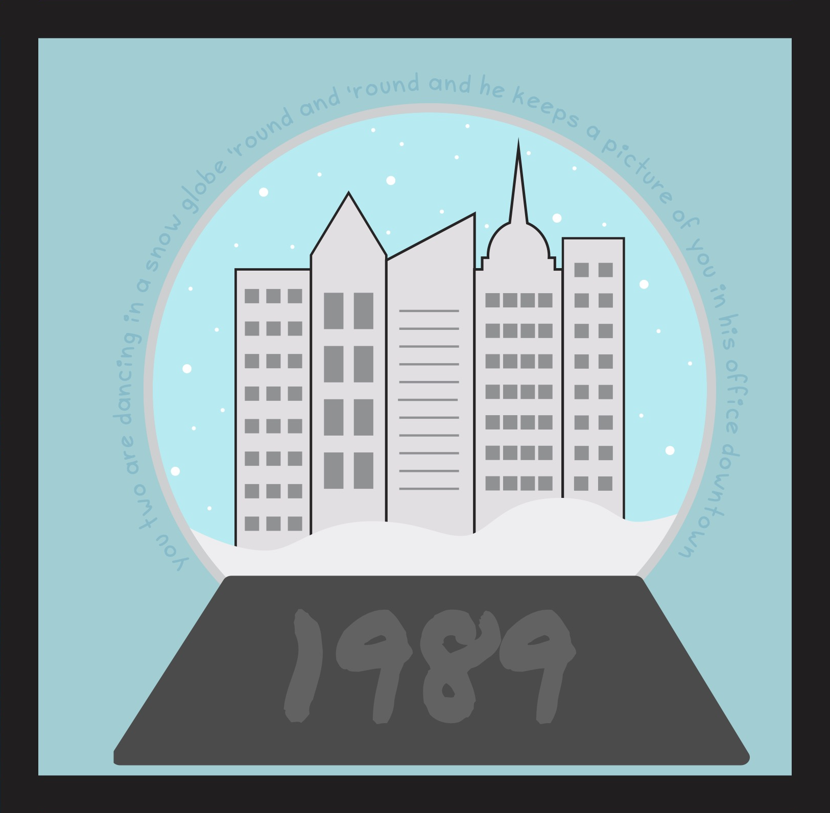
To represent the fifth album in Swift’s discography, a snow globe was illustrated to showcase a wintery cityscape inside. This visual is mentioned in the lyrics chosen from “You Are In Love”. The cityscape within the snow globe connects to the “downtown” portion of the lyrics, as well as the more general aesthetic of the album. Even more specifically, the buildings were illustrated to represent the New York City skyline. This speaks to the track “Welcome To New York” which opens the album and sets the scene of new beginnings in a big city.
1989
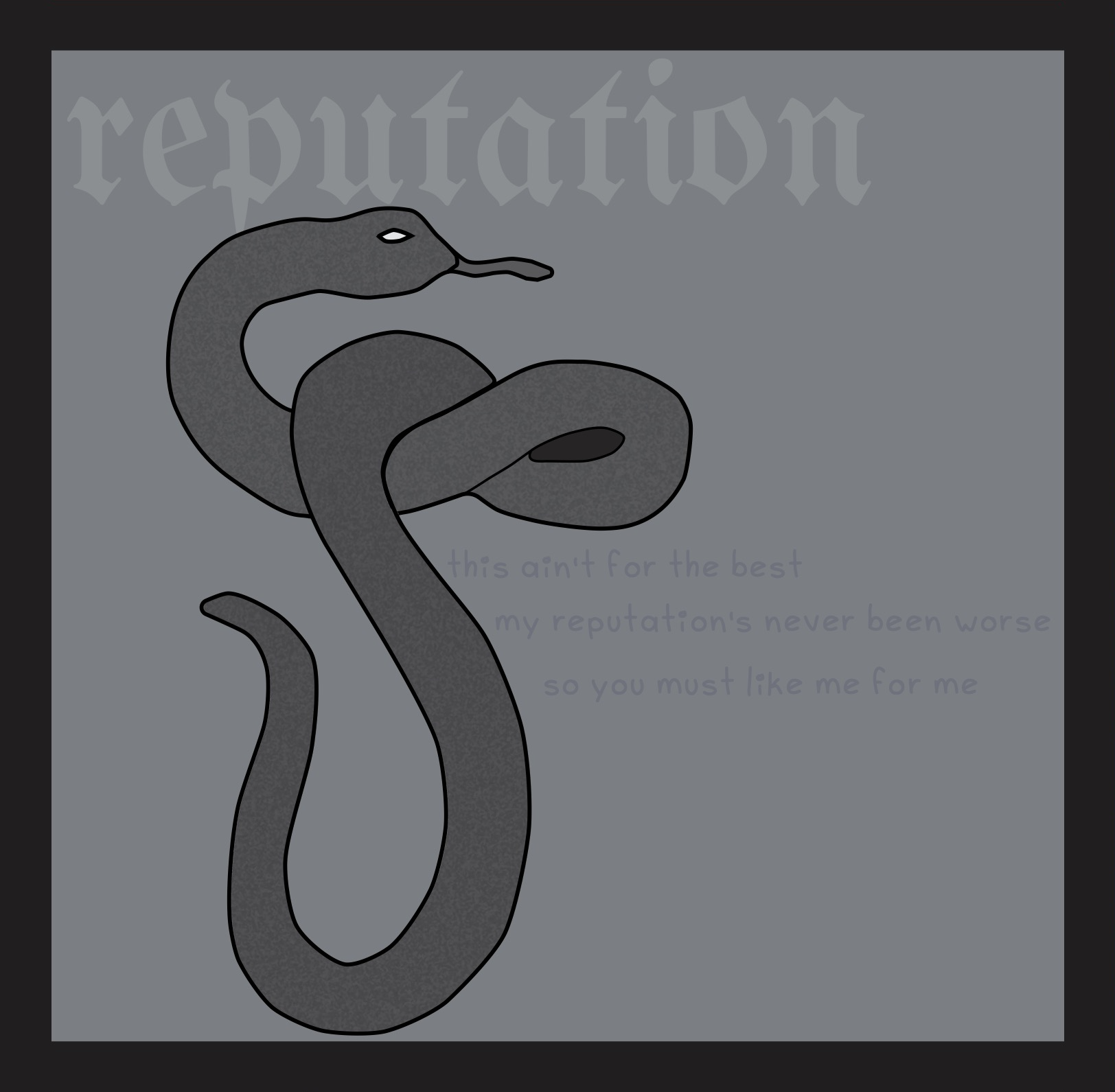
The visual created in relation to Swift’s sixth album was a snake. This connects to the album’s overall aesthetic and official visuals, including a giant snake used as a prop for the Reputation Stadium Tour in 2017. The lyrics chosen from “Delicate” mention the album title and speak to the core of the album, which is finding love and having someone that understands you amidst public scrutiny and attacks.
reputation
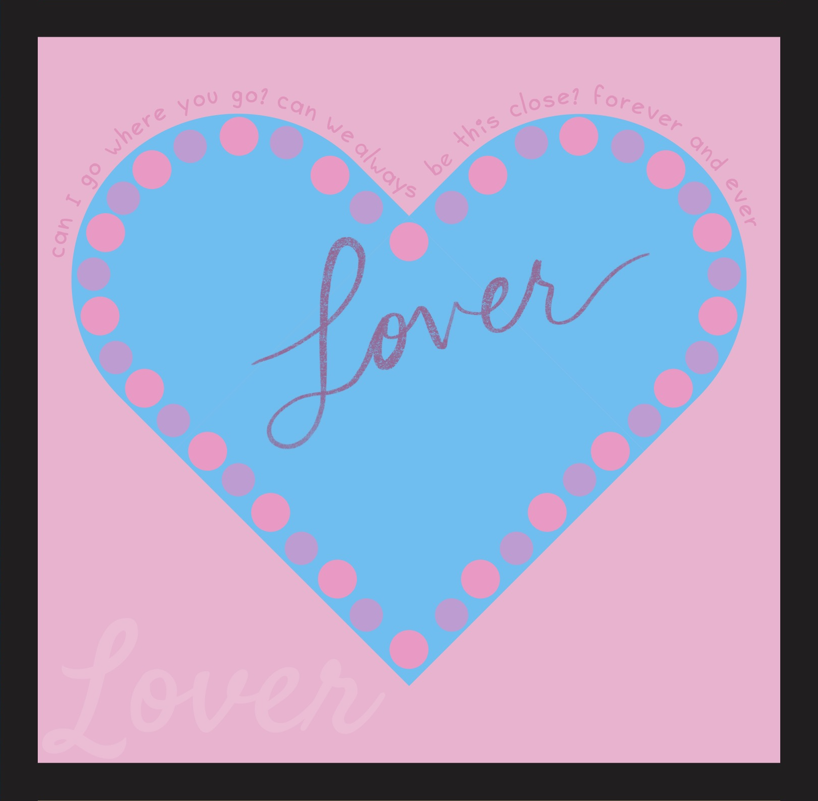
For the seventh album in Swift’s discography, a simple heart illustration was created to be the central visual. Around the border are circles alternating in light pink and purple, as these colors—along with the blue—make up the album’s color scheme. The album’s name was digitally handwritten to emulate the official cover art. Lyrics chosen from the title track “Lover” speak to the romantic theme of the album, wanting to always be by your partner’s side.
Lover
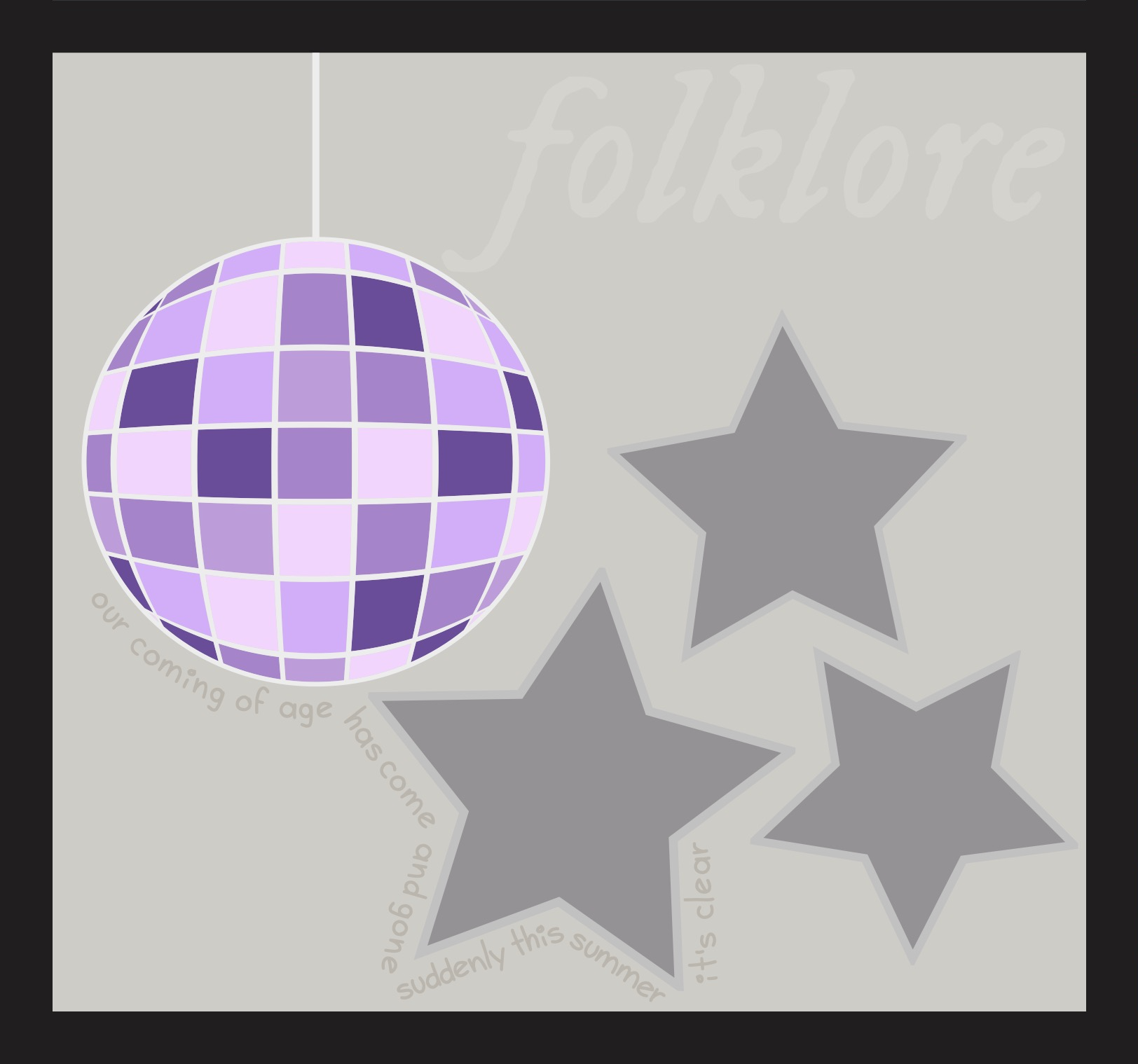
For Swift’s eight album, four illustrations were created to represent various visuals. A disco ball hanging from the ceiling was made to speak to the song “mirrorball”. Three stars were designed in relation to not only lyrics from the track “cardigan” but the design of the official cardigan merchandise as well, where a similar arrangement of those shapes are stitched onto the sleeve. The lyrics chosen from the song “peace” represent the idea of one’s time to grow up having passed. For a storytelling album written during the COVID-19 pandemic, this speaks to the theme of playful youth coming to an end and having to face the harsher realities of life, hoping a loved one will stand beside you through it all.
folklore
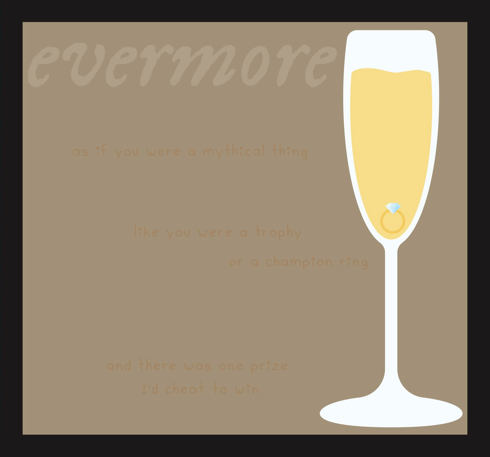
As a sister album to “folklore”, the visuals for Swift’s ninth album used identical title typefaces and similar muted colors, as is the case for the albums’ official aesthetics. A champagne glass was illustrated as the main visual to represent this album, complete with an engagement ring resting at the bottom of the glass. This highlights the song “champagne problems” in which a marriage proposal is met with an unwanted response, but also speaks to the larger theme of marriage seen throughout the album. The song “happiness” discusses the dissolution of a marriage after seven years together while the track “no body, no crime” speaks to a marital affair. Lyrics were chosen from “willow” that speak to the idea of an object of affection being a prize to be won and introduces the concept of cheating to achieve that.
evermore
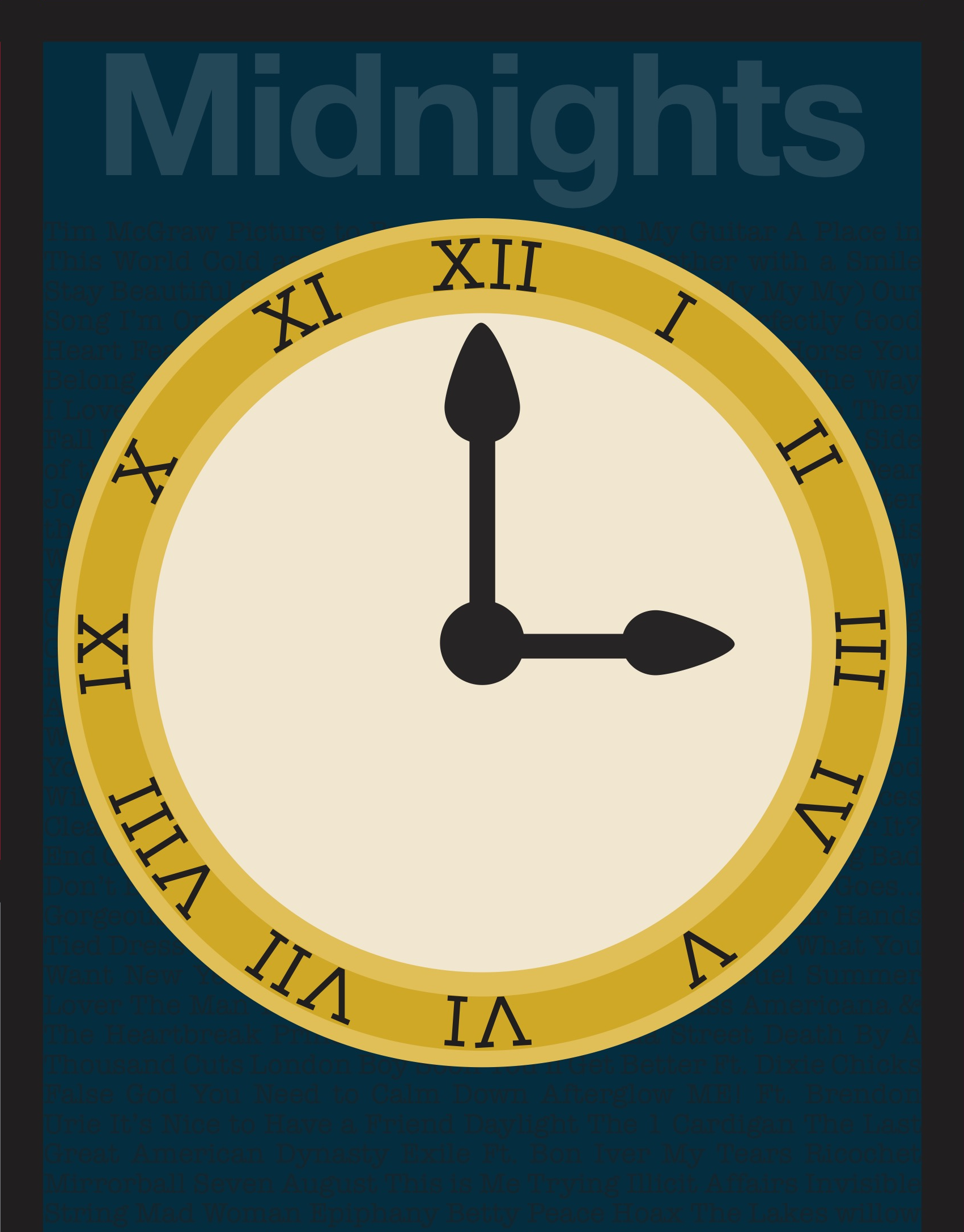
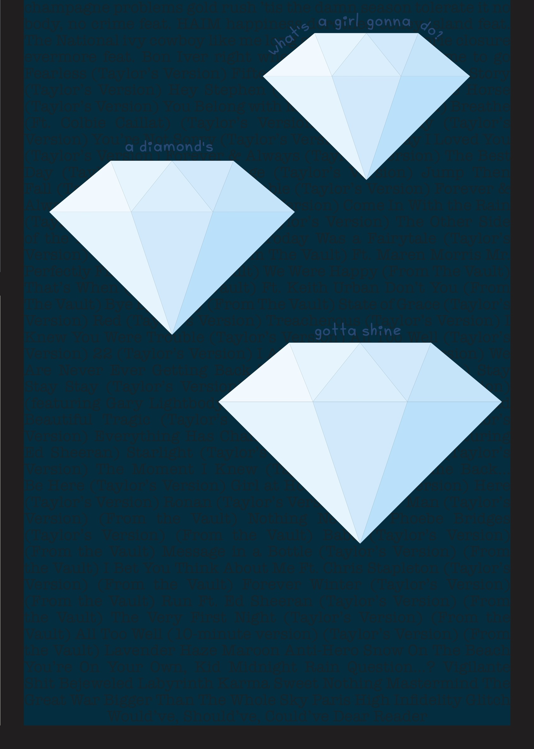
Four illustrations were created to visualize Swift’s 10th studio album. As the theme of the album is a reflection on sleepless nights throughout Swift’s life, a clock is used heavily throughout official album visuals. This was portrayed in the design with a gold timepiece. The time is set to three am to represent the “3am Edition” of the album, which was dropped three hours after the original with 7 additional tracks. Three diamonds of various sizes were also illustrated. These speak to the lyrics chosen from “Bejeweled” in which Swift reminds a neglectful partner that she shines well enough on her own.