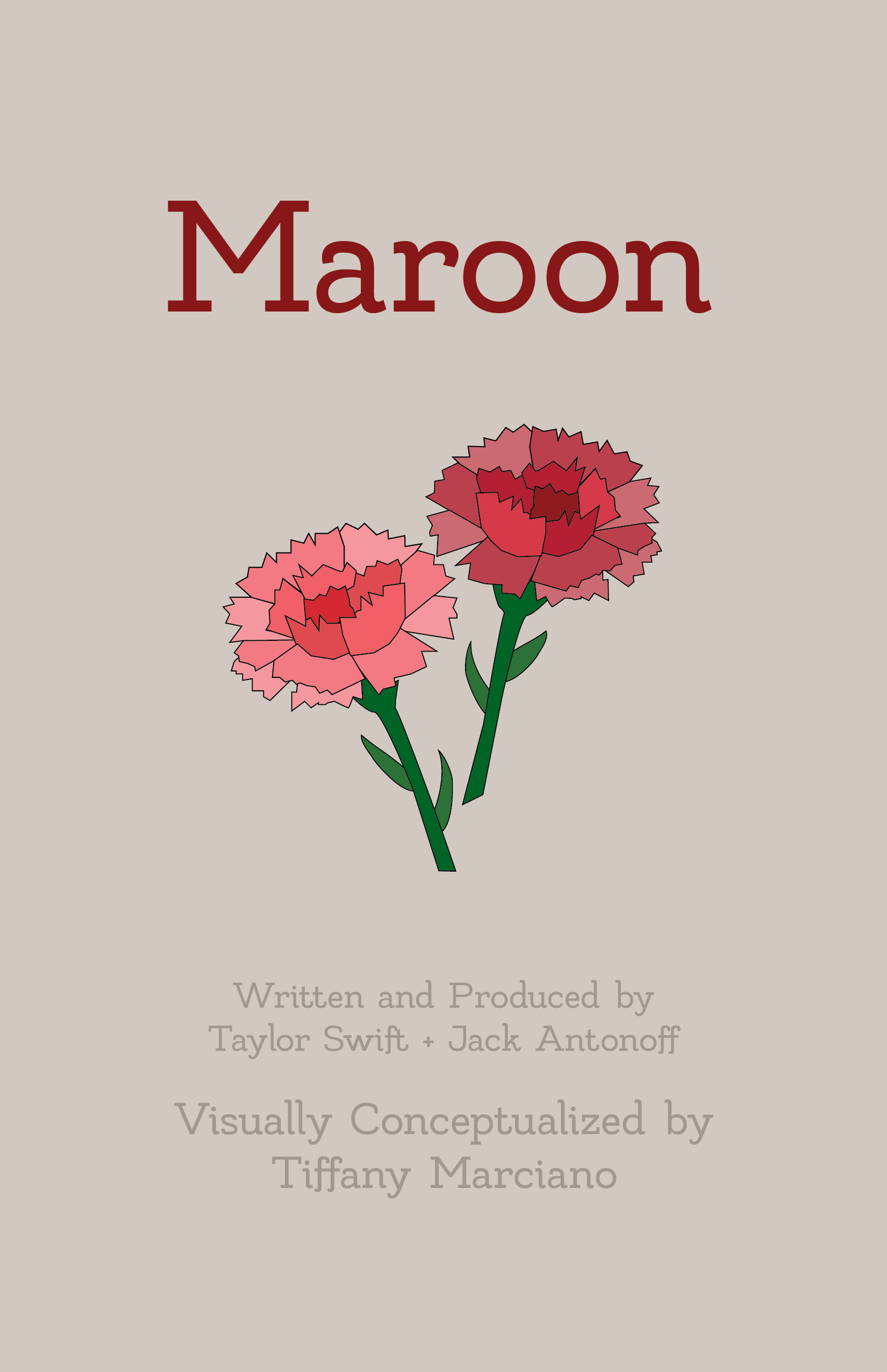
Voice-Driven Typography
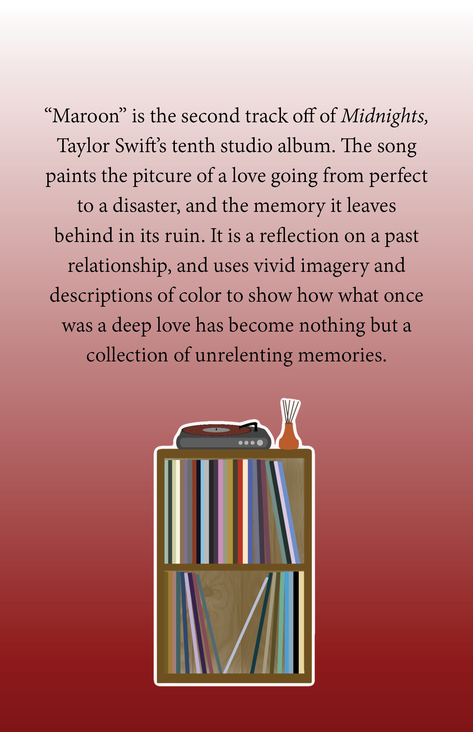
This project aimed to emphasize voice-drive typography by creating a visual of the song “Maroon” by Taylor Swift. The design utilizes different typefaces, text effects, and arrangement to guide the viewer’s experience.
The visual elements and design choices reflect not only the song’s sound, but the meaning of the lyrics. The background colors and gradients highlight the song’s tale of a romantic relationship that has turned from happy to sad, now only existing in haunting memories. That tonal shift can be seen in the visual elements themselves.
The full 14-page pamphlet offers a visual accompaniment to the song that represents the listening experience through voice-driven typography and design.
2023
Typography | Illustration
Illustrations
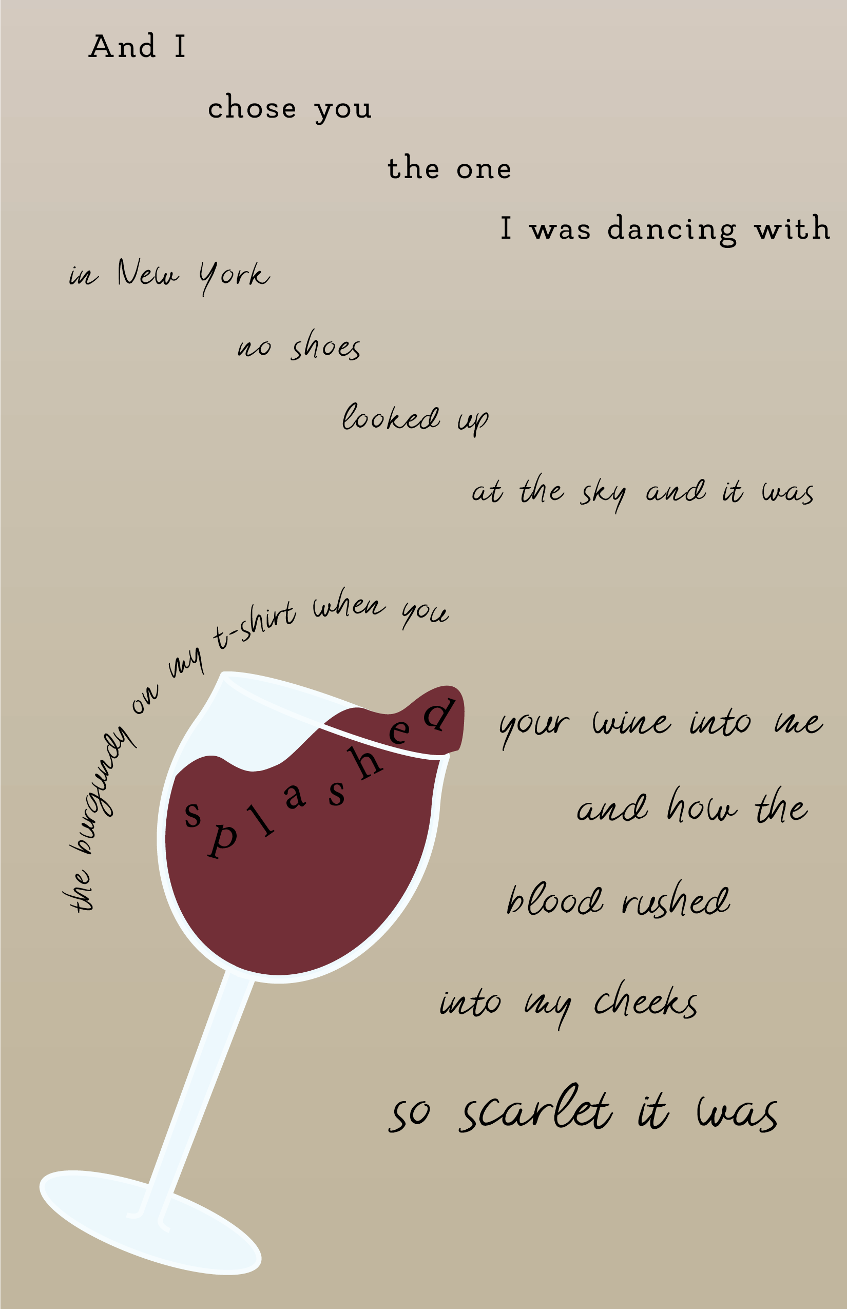
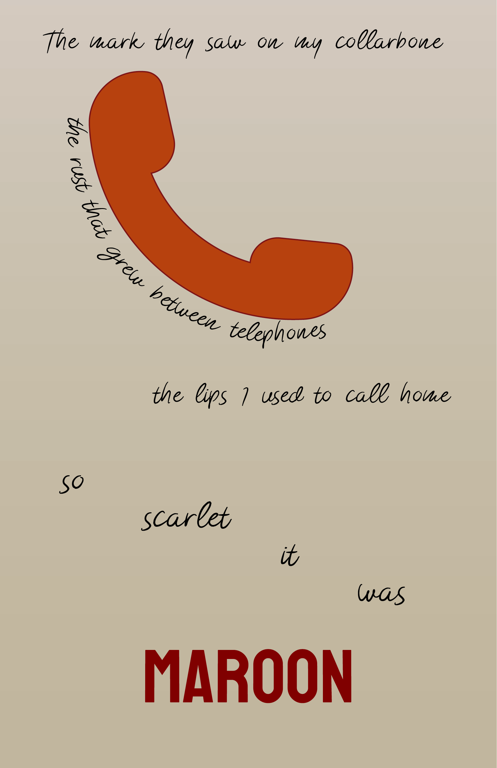
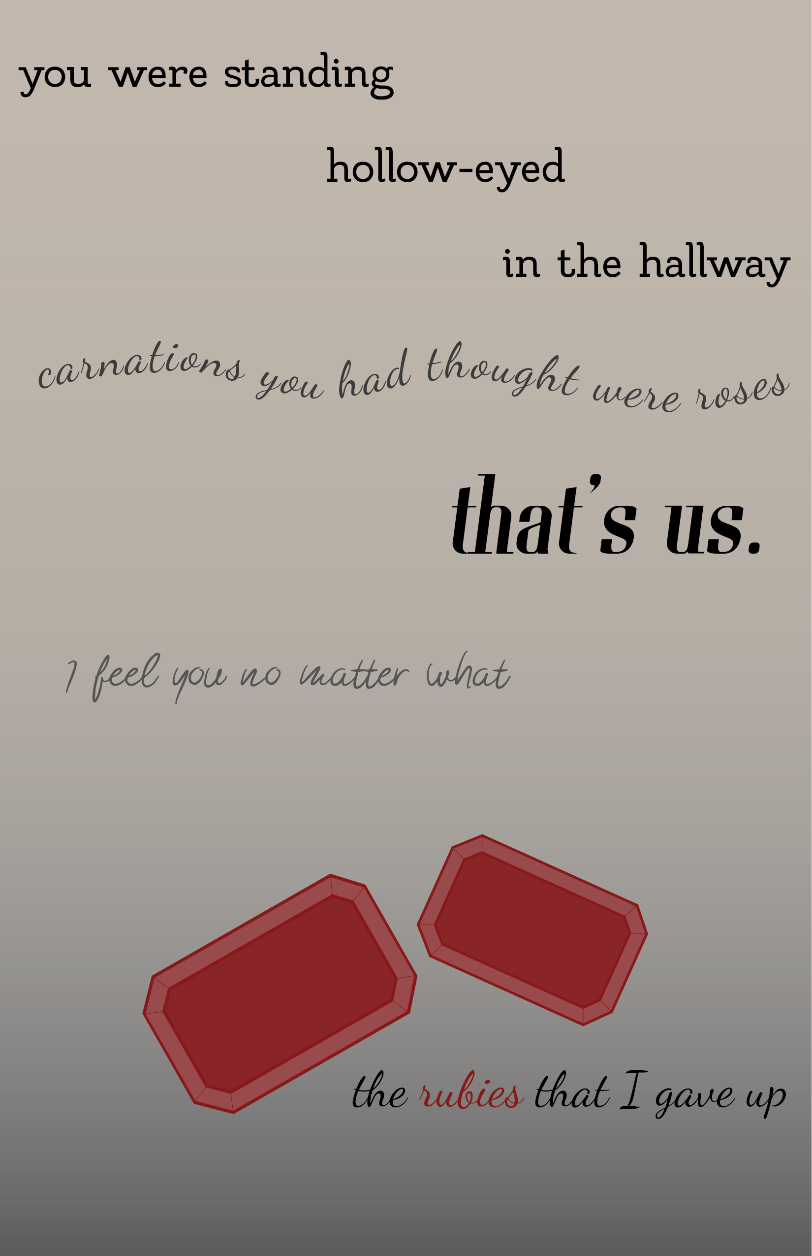
For the project, original vector graphics were created to illustrate visual components mentioned in the song. Each of these illustrations was incorporated into the design, while keeping a focus on the typography by arranging the text in unique ways around the illustrations. This ensured the text of the lyrics was still the main component of the design and allowed creative display in the interaction with other visual elements.


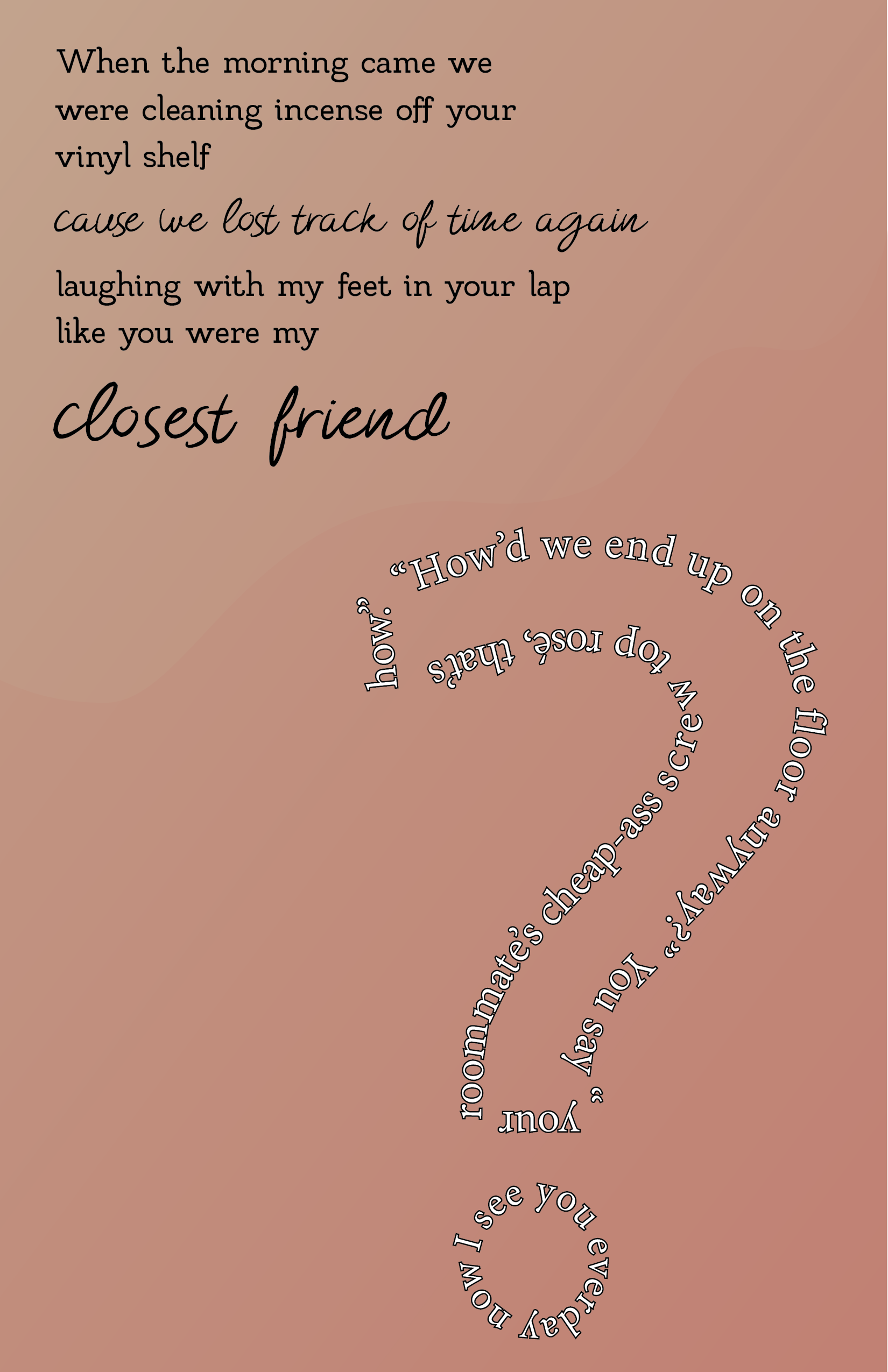
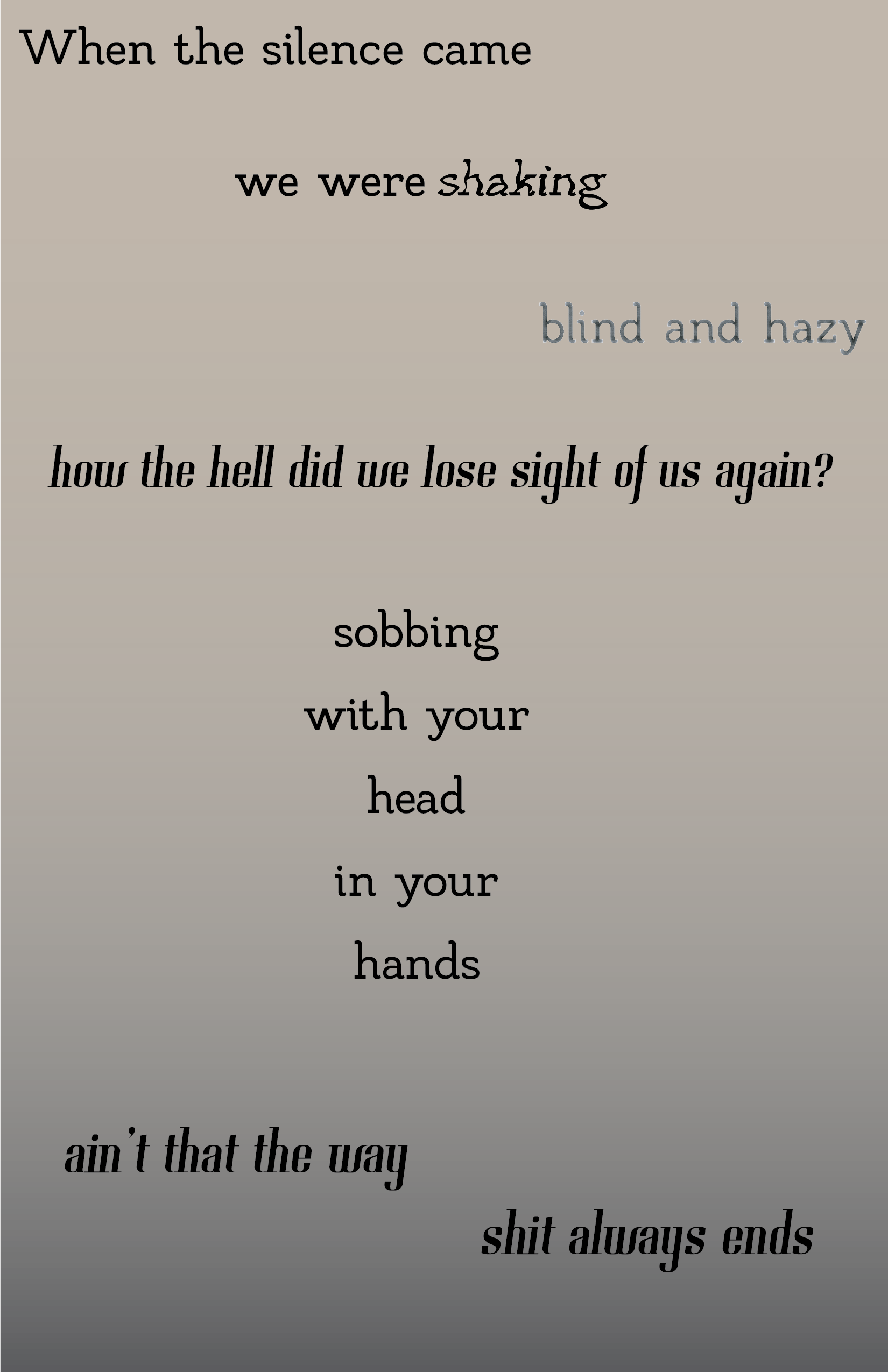
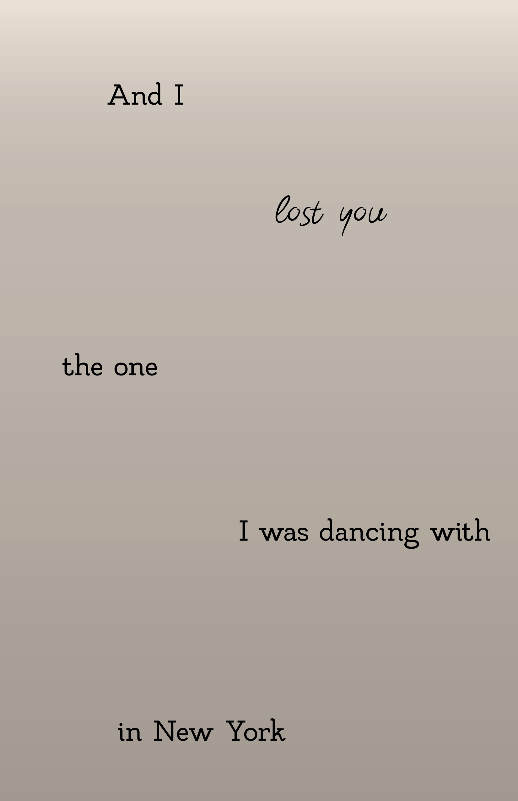
In “Maroon” there are changes in singing pace, different intonations, and parts of overlapped singing. To highlight this, the text alternated between serif fonts and script fonts to contrast different lines and how they are sung. The spacial arrangement of the lyrics themselves was utilized to relate the design to the lyrical meaning.
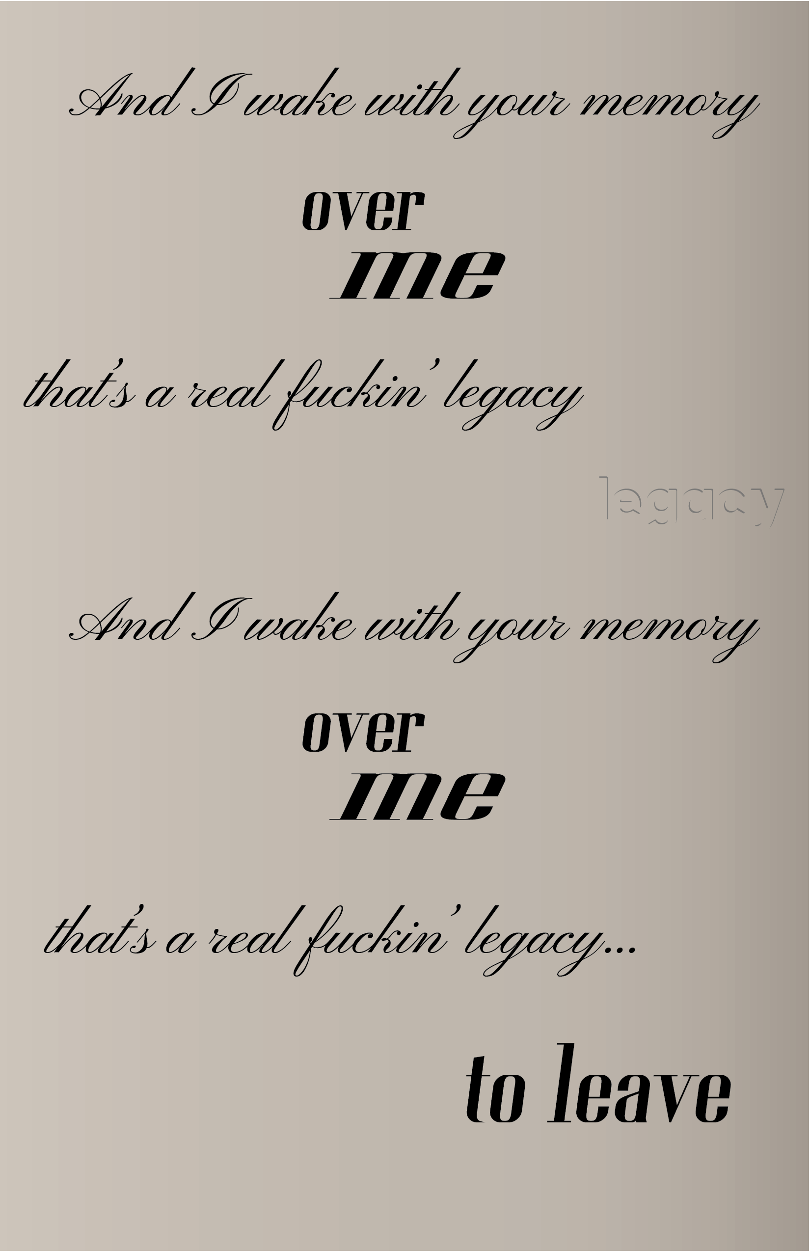
During the bridge of the song, the first repetition of the word “legacy” is drowned out by other lyrics being sung over it. To visualize this, that word was made to be barely visible and fade into the background as the lyric itself does. This technique is utilized again for other instances of words that get sung over and buried beneath the music.
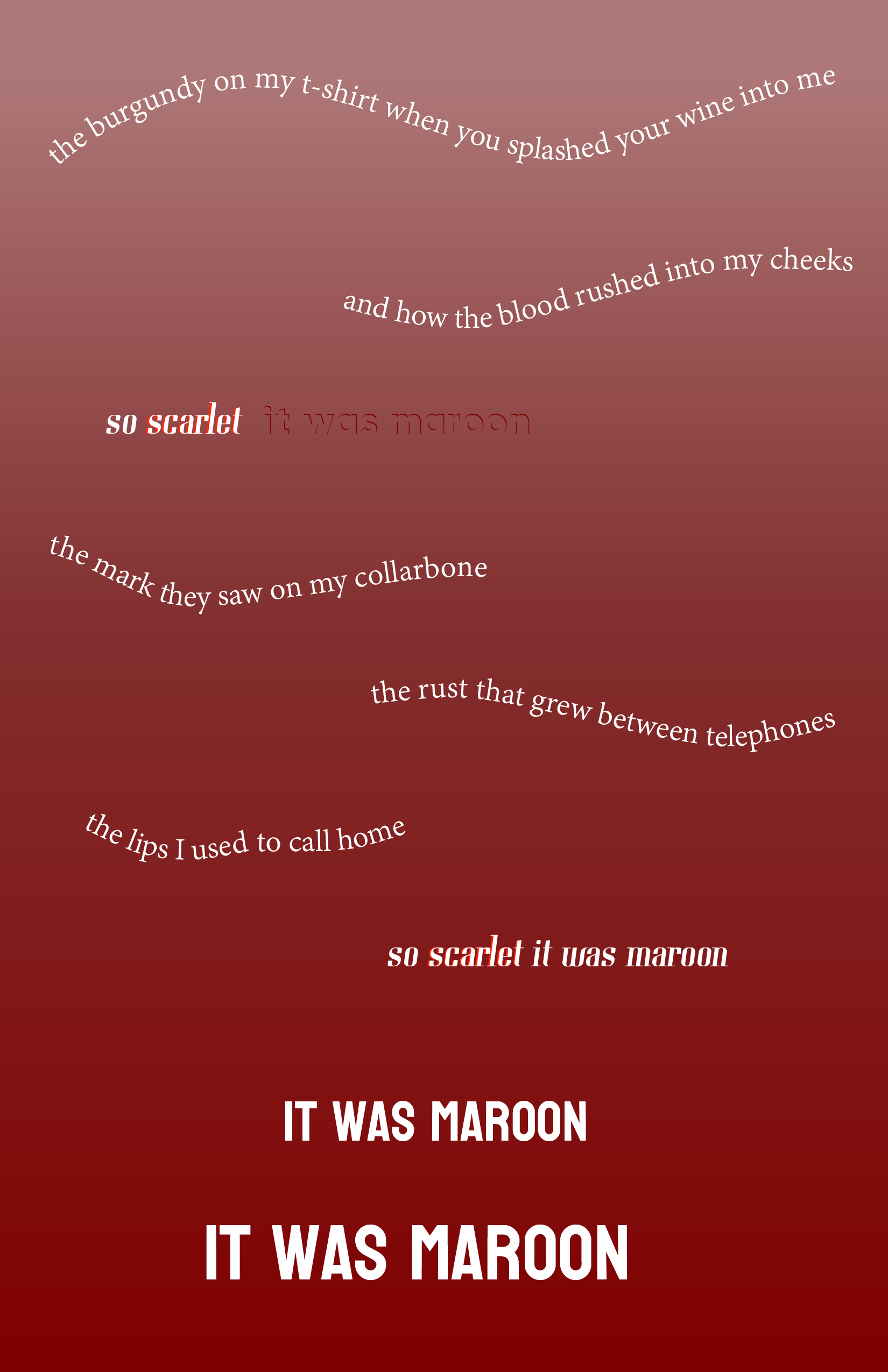
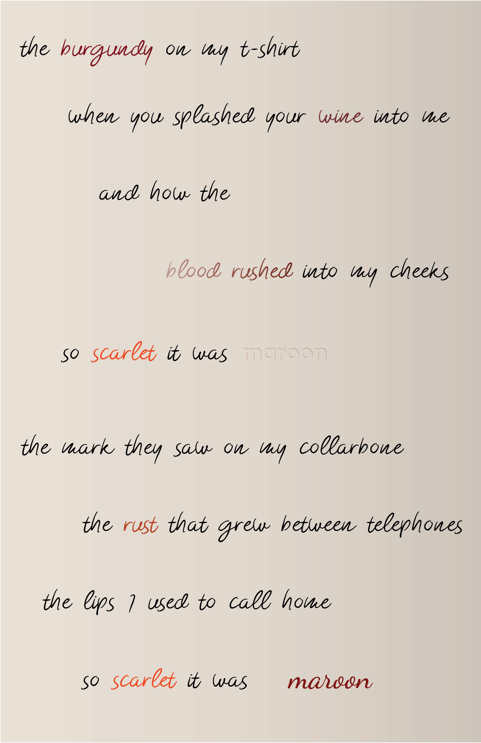
The lyrics themselves evoke strong imagery and list multiple shades of red. These colors were used not only in the background gradients and illustrations, but for the text itself. To show the contrast of the hues being sung, the word “scarlet” is shadowed in that color to stand out against the gradient. This highlights the lyrics’ comparison of scarlet to maroon.
To represent the movement of sound, the lines of lyrics are arranged in wave patterns to show the rise and fall of the voice singing. The size of the text increases with the final two lines of the song, as they are enunciated more clearly. The larger presence of them on the page shows the finality and crisp vocalization as the song ends, leaving a lasting impact on the viewer.